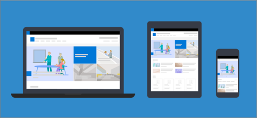
Modern pages and web parts are designed to be fully responsive across devices, meaning that images used in web parts will scale differently depending on where they're shown, which layout is used, and the device on which they are being viewed. For example, modern pages are designed to look great on mobile devices, and automatic image scaling helps create that attractive experience.
What image sizes work best?
Because of the responsive page design, there's not a specific height or width in pixels that will ensure that an image will maintain a specific shape across devices and layouts. Images are resized and cropped automatically to show the best possible result across a variety of devices and layouts. However, there are some guidelines that can help you make sure your images look great on your pages.
Finding the best image sizes for your page depends on these factors:
-
Aspect ratio: the relationship between height and width of images
-
Column layout: the type and number of columns on your page
-
Web part layout: the layout you choose for the web part in which the image is being used
Aspect ratio
An aspect ratio is the relationship between width and height of images. It's usually expressed as two numbers, such as 3:2, 4:3, or 16:9. The width is always the first number. As an example, a ratio of 16:9 could be 1600 pixels in width by 900 pixels in height. Or, it could be 1920 x 1080, 1280 x 720, or any other width/height combinations that can be calculated to equal 16:9. You can find aspect ratio calculators online and in some photo editing tools to help you determine the aspect ratios of your images.
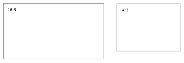
In most cases, images in modern web parts work best across layouts and devices when they have an aspect ratio of either 16:9 or 4:3, depending on the layout.
Column layouts
A page can be laid out with sections that include different column types and layouts, such as full-width columns, one column, two columns, three columns, one-third left and one-third right columns. A general rule for images expected to fill the width of a column is that they be at least as wide as the column in which they're placed. For example, an image in an image web part in one column should be at least 1204 pixels wide.
Following are the width guidelines for each of the column layouts:
|
Layout |
Width in pixels |
|
Full-width column |
1920 |
|
One column |
1204 |
|
Two columns |
586 per column |
|
Three columns |
380 per column |
|
One-third left column |
380 for left column; 792 for right column |
|
One-third right column |
792 for left column; 380 for right column |
Because of the responsive nature of pages, images in full-width columns will always display at full-width of your screen with an automatic height based on screen size.
The height of images placed within other column layouts will depend on your aspect ratio. Here are height/width guidelines for 16:9 and 4:3 aspect ratios (rounded up/down to the nearest pixel). This is helpful to keep your images at a width and height that scales appropriately for mobile devices, for example:
|
ASPECT RATIO LAYOUT |
16 x 9 Width x Height in pixels |
4 x 3 Width x Height in pixels |
|---|---|---|
|
One column |
1204 x 677 |
1204 x 903 |
|
Two columns |
586 x 330 |
586 x 439 |
|
Three columns |
380 x 214 |
380 x 285 |
|
One-third left column |
380 x 446 for left column; 792 x 446 for right column |
380 x 594 for left column; 792 x 594 for right column |
|
One-third right column |
792 x 446 for left column; 380 x 446 for right column |
792 x 594 for left column; 380 x 594 for right column |
Web part layouts
The layouts in the web parts you use will also affect how your images scale. The following examples show different web parts and some of the options and aspect ratios you can use.
|
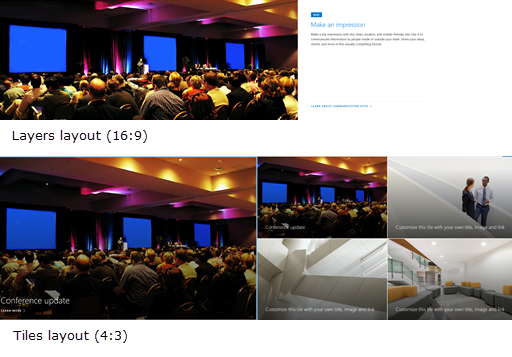
The following aspect ratios for Tiles and Layers layouts are:
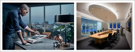
Here's an example of an image shown in the Layers layout (top) and Tiles layout (bottom):
|
|
|
16:9 is the aspect ratio for Carousel, Filmstrip, and Grid layouts. Here's an example of 16:9 aspect ratio. The first image shows the Filmstrip layout, and the second shows the Grid layout:
|
|
|
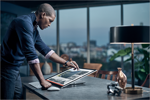
Images will expand to the width of the section containing the web part. Here's an example of an image in the Image web part that uses the 16:9 aspect ratio.
You also have the option to change the aspect ratio or free-hand crop using the Image editing tool or use the resize handles to make your image bigger or smaller.
|
|
|
The following aspect ratios can be used in different layouts:
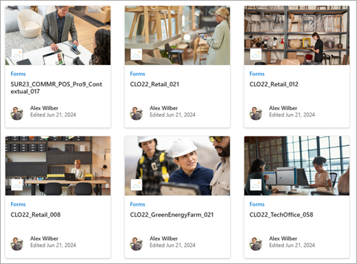
The first image shows the Brick layout in theImage gallery web part (keeping the 16:9 and 1:1 aspect ratios). The second image shows the Grid layout (using the 1:1 aspect ratio).
|
|
|
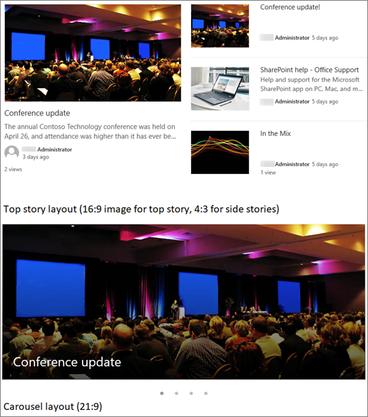
Depending on the layout, images in the News web part can be 4:3, 16:9, or 21:9. Here's an example of images in a Top story and a Carousel layout:
|
|
|
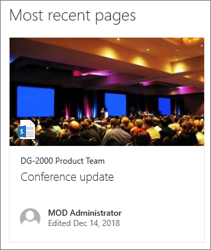
Images look best when they're landscape or 16:9 or greater in aspect ratio, and when they're at least 1 MB in size. Also, be sure to set a focal point to the keep the most important part of the picture in view, especially when the picture is used in thumbnails, news layouts, and search results. Example (original image 16:9) with focal point set on the speaker:
|
|
|
Page thumbnails are shown in places like search results, highlighted content results, news posts, and more. By default, the thumbnail comes from the page title area or from the web part that's in the first order on the page (such as top left of a page layout). You can override the default and change the page thumbnail. When you do so, it's best to use an image with a 16:9 aspect ratio. Example (original image 16:9):
|
|
|
The Quick links web part has six different layouts. Here are the preset aspect ratios:
The first image shows the Compact layout in theQuick links web part. The second image shows the same Quick links web part using the Filmstrip layout.
|


Tips:
-
When you add an image to a page title area or Hero web part, it's also best to set the focal point in the area of the image that you want to always display. To learn more about setting a focal point for these two scenarios, see Use the Hero web part and Create and use modern pages on a SharePoint site.
-

Site header image recommendations
In addition to pages, you might want to add custom logos or images in an extended layout. Here are size recommendations for those elements.
|
Element |
Description |
Recommendation Width x Height in pixels |
|---|---|---|
|
Site logo |
Larger logo that can be non-square and transparent depending on the design uploaded. |
192 x 64 Format: PNG, JPEG, SVG (SVG isn't allowed on group-connected sites) |
|
Site logo thumbnail |
A square logo thumbnail that's used if no site logo is uploaded or in places that a square format is required. This element is required. |
64 x 64 Format: PNG, JPEG, SVG (SVG isn't allowed on group-connected sites) |
|
Extended layout site logo |
The extended header layout has an extended site logo width. |
300 x 64 Format: JPEG, PNG, SVG |
|
Extended Layout background image |
A new background image that can be used with the extended header. |
2560 x 164 Format: JPEG, PNG |